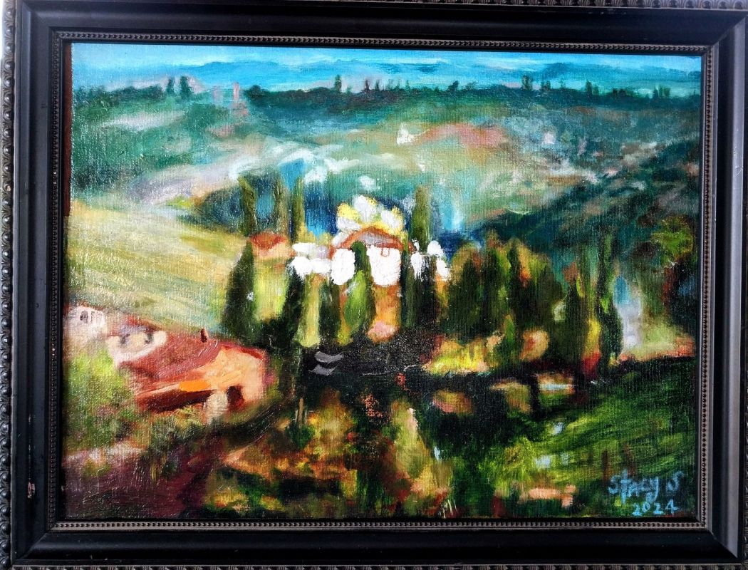

Stacy Sweeney | Chianti, Italy | 2024 | Oil on canvas pad, PVA glued to a shellaced and sanded MDF board | 12″x16″ | original photograph by Chris diDomizio
Art & Theory in Chianti, Italy, Landscape Oil Painting
One way to understand and appreciate works of art is by means of formal analysis, that is by looking at them not in terms of subject matter or technique, but in terms of purely formal concepts.
Through a careful study of Renaissance (late 15th- and early 16th-century) and Baroque (17th-century) works of art, Wölfflin distilled a number of principles, which he arranged in five pairs, which helped him characterize the differences between the styles of the two periods.
//.http://arthistoryresources.net/baroque-art-theory-2014/wolfflin-renaissance-baroque.html
1. Planar or Recession
Planar and Recession have a place in every type of visual art today. Recession is when the lines are diagonal to the edge of the picture plane. Diagonal lines evoke action, excitement, movement and depth. The strongest angles of my painting are… everywhere, and the soft edges keep your eye in the painting. I connected the dark shapes of the landscape to create mass and to hold the painting together.
Diagonal lines are my visual clue; that’s how I remember Baroque art. It says diagonal lines > Recession. Vigorous diagonals contrast with the verticals and horizontals of the frame. Diagonal lines not only play on the surface of the picture, but move back into depth.
Peter Paul Rubens is the beginning of Baroque painting.
He rotated his angles to be read diagonally to the page. Imagine my diagonal mountain in shadow to the right is in the nature of the diagonal angle of Rubens black horse rearing up on the right. Spooky! No, they are art tools, principles from the old masters, but there’s something a little more. The dark arrow on my lower left is the diagonal line that leads you into the painting to the focal point, the white house. Again, this is analagous to Rubens’ dark arrow on the lower left leading the viewer to the heart of the, Battle of the Amazons. Once I put in a diagonal line, as a matter of course, I put in more diagonals to harmonize. The diagonal difference of Baroque art is when I physically allow you to enter the space, as if you are part of the scene, and the painting becomes a dynamic narrative.
2. Linear or Painterly
When I bring attention to the white stucco house and the swirly pattern of Cypress trees, I had to nail the texture and shape. This is where my drawing and brushwork really matter. That little bit of white texture and the Pencil Pine shape is all I need. You recognize the type of house and tree right away. Boom, done. How many notes do you need to name that tune? You’re own business. That’s painterly.
The benefit of using a complimentary palette is mainly to harmonize the scene, because the semi-neutral and neutral grays
are now everywhere, even disappearing into the scene. This is also called painterly.
Where the Cypress trees are not evenly illuminated but are fused together, seen in a strong light which comes from one direction and reveals some things while it obscures others is painterly. Contours are lost in shadow, swift brush-strokes bind separate trees together rather than isolating them from one another. Painterly.
3. Closed Form or Open Form
In the open form of my Baroque painting, the trees, fields and mountains are not simply contained within the frame, but are cut off by it at the sides. There is a feeling of space beyond the edge of the picture. The composition is dynamic rather than static; it suggests movement and is full of momentary effects, as opposed to the tranquil repose of the Renaissance painting. The sky’s negative space and the open road allow atmospheric depth. An open composition allows you to enter the landscape and it is open to you today.
4. Multiplicity or Unity
A pair a terms which is most obviously relative, for all great works are unified in one way or another. What Wölfflin means here is the unity of my Baroque painting is much more thoroughgoing, largely achieved by means of the strong, directed light. All the units – and there are many of them – are welded into a single whole; none of them could be isolated. Colors blend and mingle, and their appearance depends largely on how the light strikes them. For instance, the color Sap in the Cypress trees are visible only in parts, others like Prussian Green, being in dark shadow.
5. Absolute Clarity or Relative Clarity
Absolute Clarity and Relative Clarity are more or less self-explanatory, given the above categories. For Wölfflin, absolute clarity is arrived at through representing things as they are, taken singly, while relative clarity is the result of representing things as they look, seen as a whole, relatively speaking.
The last two categories, 6 and 7, do not pertain to Wölfflin’s five formal concepts to distinguish Renaissance (late 15th- and early 16th-century) and Baroque (17th-century) works of art, but seem to have developed in the Neoclassical era (18th-century to present).
6. Symmetrical or Asymmetrical
Photographers tell you never put something in the middle, and I’m telling you the white house is smack dab in the middle! The textured finish of the stucco house is the ☆ of the show and contributes to it’s aesthetic charm. Painted after the SAP green Cypress trees, the white house was my visual measuring gauge throughout the painting.
Although the white house is smaller farther away than the red houses on our left side, the red houses do not occupy the same visual attention because of color, texture and location. However, the clean color and the texture of the orange and burnt sienna brush strokes cause the red houses to come forward. Brown, by the way, is in the red family. I brushed on globs of white paint on and around the white house compared to the scumblling of oranges and reds to our left. The painting is asymmetrical and it feels like it’s unequal, unscaled or unbalanced, like me.
7. Colore or Desegno Approach
There’s form and function and purpose to everything – that’s desegno. Desegno is designing of the page, organizing shapes, textures, and patterns through careful thought. I spent 100 hours drawing and measuring this landscape from photograph directly onto the canvas pad with a pencil. That’s desegno, and that’s what TAKES SO LONG! Just smear the paint on already and draw with a 1″ brush. Honestly, this painting took a whole year of speculation and embarrassment, painting in studio, and I felt like Rubens’, Battle of the Amazons. I’m of the nature to run ahead instead of slowing down to put doors and walls and roofs on houses. The reason I stuck with it each week is because it became a Christmas gift to my oldest son, Jackson, and his wife Hannah, who spent a three week honeymoon through Italy in 2023, and currently live in Charlotte, NC. The painting will become more and more transparent, as I used transparent Sap and Prussian Green, with time.
°°°°°°°°°°°°°°°°°°°°°°°°
Understanding the compositional choices available through art mapping called the shots on implementing art principles in my landscape, and the wtiting of this 1,300 word critique. It is not a crime to paint the Renaissance way for a Renaissance man or woman, but the message of my painting is so Baroque: excitement, movement and depth; a dynamic narrative inviting you into the scene; a feeling of space beyond, the sun rising onto the scene from behind the mountain while the right side is just awakening.

§tacy §weeney
